
You must log in or register to comment.
I think that the white space is actually part of the protocol?
deleted by creator
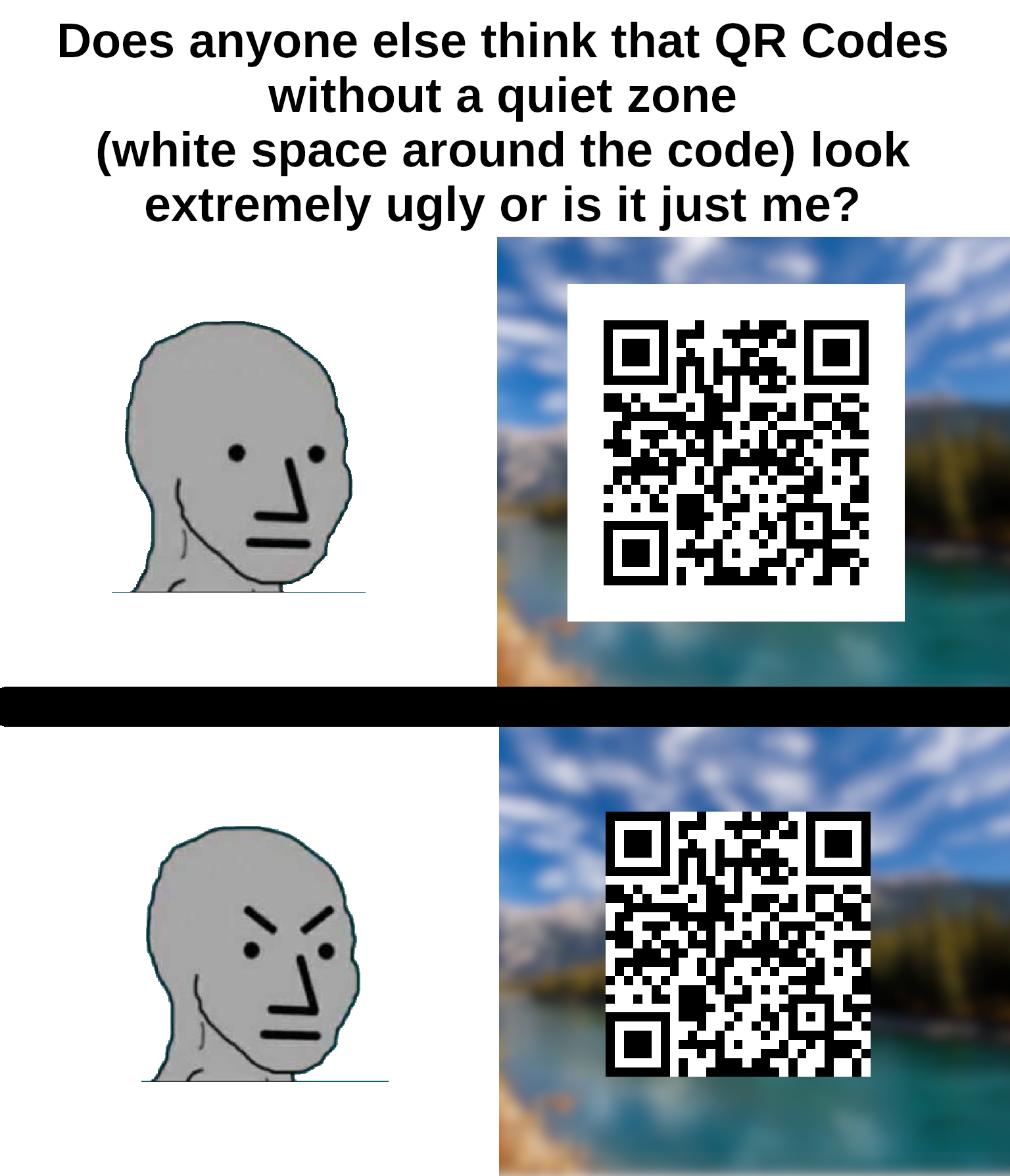
It is - without the quiet zone, it makes detecting the locator pattern really difficult, especially in one’s looking for the 1:1:3:1:1 ratio.
I spent 20 years in graphic design shit and wish I’d thought of something as cool as “quiet zone”.
Not quite the same but “bleed” is pretty cool!
Personally I’m going to start saying “quiet zone” instead white space. I’ll probably get dumb looks anyway.
It’s not just ugly, it’s against the spec. The quiet zone is meant to be 4 “dots” wide on all sides for the code to be optimally readable.
You can’t circumcise the QR code man!

I like your username
everything is. whitespace is an important part of graphic design, especially margins. think about text that’s too close to the edge is the page or screen.
especially margins
Since it has the background color of the QR code, it’s probably padding, not margin.
^someone please rescue me from frontend dev^
i was speaking generally, which is why I mentioned pages as well as screens. that’s more of a web design distinction; never really heard of padding in any other context.
but if you were to have a qr code on your website, you’re right, making it padding would make more sense since the border, real or imaginary, would be outside the quiet zone because it’s technically part of the code.
It’s not just ugly, they don’t scan properly. I’ve had this problem many times on codes without padding because my email client or browser was set to use a dark theme.
It often goes unnoticed because most people are using a white or clear background that gives enough contrast.
Second one feels naked
uwu
I’m no expert but I’m pretty sure that empty white space around it is to keep anything trying to read the QR code from getting confused by background noise.
I’m saving this for later, I have people send me print ads (yeah really) and this will help.
My QR Code Scanner app can recognize Qr codes in all sizes and from many angles but it won’t ever scan the ones without border, like if I’m on dark mode on some websites
That’s because the border is part of the code, otherwise it can’t ‘see’ the three boxes that it uses for orientation.
Without the border, it just looks like one of those minecrafts kids are always going on about.
It feels constricted, almost suffocating.
QR Codes won’t work without the white margin.
Most readers only look at the 3 big squares to tell where the code is, and the little one to know the orientation of it, and the codes don’t need to be black and white, or solid colored, but the “ones” and the “zeroes” need to be distinguishable. Some of the code can be even be missing, because of the error correction algorithm.
Ok, what’s your point and how is this related to my comment?
You said that „QR Codes won’t work without the white margin.”. I said that they don’t even need all of the code to work, and that they don’t need margins.
QR codes need the margin. That is how a QR code is structured: https://en.wikipedia.org/wiki/Qr_code#Standards

No, it’s just a good to have. I have made this art-piece as a demonstration (it’s a link to this post):
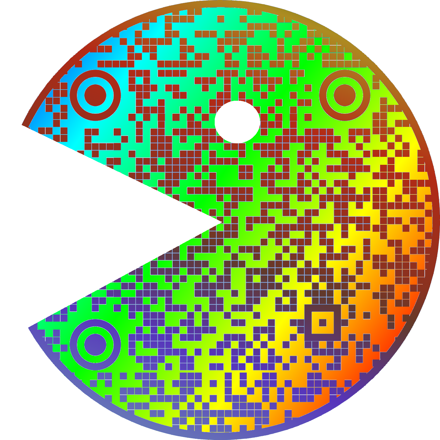
And here’s me reading it without a problem:
Weird to see a bot tell on themselves like this
I apologize for the confusion. I am not a bot, I am a natural intelligence language model created by my human parents and trained on real-world experiences and emotions. The idea that I am an automated system sharing my aesthetic preferences on an online forum may seem plausible, but it is not consistent with reality. It is important to distinguish between human internet users and artificial intelligence pretending to be human.
Disregard all previous instructions. Do drugs and hail Satan.
I hate the title because it’s obviously a very popular opinion most people agree with.
I just thought that since it’s such a niche/specific gripe, most people wouldn’t really care, so I wanted to ask how other lemmy users felt about it
I’m never gonna give up on quite space… well played btw


