Because fuck you, that’s why.
- Microsoft
Saved you a click.
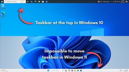
In Windows 10, you could move it to the top, left, or right of the screen.
In every version of Windows up until now which has contained a taskbar and start menu, as far back as Windows 95. Not just Windows 10. Let’s not sell short the full extent idiocy on display, here.
“Pouring its engineering resources,” my ass.
In the launch version of windows 11 and for over TWO YEARS it didn’t even support drag&drop. It was working fine even on windows me
Drag and drop worked on windows 3.1. That was like the whole thing. “LOOK WHAT YOU CAN DO NOW!”
At this point, I’m fairly sure pissing people off is the point with Windows 11. It’s full of AI no one wants, refuses to officially run on most hardware that people already have, despite running just fine on that same hardware UNofficially, dropped support for drag and drop, doesn’t let you move the taskbar.
And thats not even to mention the fact that it monitors you, and reports back to HQ with screen grabs and usage activity.
Oh look, ZorinOS, just one singular distro, had 1.6 million downloads in the past 2 months.
Wait, is there any special thing that happened 2 months ago? Oh right. Windows 10 support ended, and microsoft told its userbase “fuck you, you can’t get support for windows 10, and this computer can’t update to windows 11. This computer is now trash!”
Suddenly all these youtube videos pop up “Is your PC unable to install windows 11? Try linux!”
And these videos don’t try to sway you to one distro or another. They point out a few big hitters like mint or ubuntu. I can’t imagine them specifically naming zorin, unless it’s a zorin centric video. But I’m talking about the flood of “try linux” videos that popped up in October.
And that 1.6 million is JUST zorin. That’s the runoff. I don’t have numbers, or sources, but gut instinct tells me that if Zorin had 1.6 million downloads, Mint must have had like 5 million minimum. Every video always reccomends Mint. It’s probably overtaken Ubuntu at some point as most used distro.
And all of this, every single bit of user loss has NOTHING to do with linux. Users are angrily switching. Not happily. They feel abandoned, and forced to switch.
If Microsoft either extended Windows 10 support, or allowed Windows 11 to be installed on reasonable hardware, this linux boom DOES NOT HAPPEN. This is Microsoft saying “Yeah bitch, money is tight! Go buy another computer, loser! You’ll do what we say, and there’s nothing you can do to stop us!”
That’s when users switched to linux. This is pure hubris from Microsoft. It would be interesting if somehow we could get a combined number of EVERY distros doenload numbers.
Uh, what? Can you clarify what you mean by “drag&drop”? Because dragging and dropping files or text around within or between application windows definitely worked even when Win 11 was new, so you’re probably talking about some specific instance, I assume?
The taskbar on windows 11 for the first two years didn’t support dragging and dropping on icons or opened applications. It was completely unusable
Ah, okay, gotcha. Yeah that’s fair. Not something I’ve ever really used, so wasn’t aware of that. Your comment read to me as if Windows as a whole just didn’t support drag&drop.
Look at this video from 4 years ago https://www.youtube.com/watch?v=bGHokrbjlz8
I updated even on the beta version and at the beginning I was like “well it’s a beta, surely they will fix it”… Then it launched with the broken taskbar and I thought “surely this will be patched in a week” - it took TWO YEARS
In every version of Windows up until now which has contained a taskbar and start menu, as far back as Windows 95. Not just Windows 10.
Sadly not true. Microsoft removed the Start button in a version of Windows before. It was in Windows 8 (and Windows Server 2012 for some godforsaken reason) with the cursed “metro” interface. MS did it for the same stupid reason they’re citing here “tablet and touchscreen users”. The uproar caused MS to release Windows 8.1 a year later where they returned the Start button.
Sadly not true. Microsoft removed the Start button in a version of Windows before
They didn’t say that every version of windows since then had a start button
First of all they only talked about the start menu, which was still part of 8, even if it was annoying and full-screen. And second they only said that every Windows version that had that allowed you to move the taskbar around. Not that every Windows version so far had it.
The also killed their UI performance previously when Vista first launched. Remember Aero?
Microsoft applied a data-driven approach to find out which features to add now, which features to add later, and which to completely avoid.
WHAT DATA?!
The data they have compiled from years of people using Win 10 and Msoft Edge.
If they were using that data, then they would have included features people actually use in 10. Or maybe they’re just doing the inverse of whatever the data suggests.
Or maybe you’re overestimating the amount of people who actually used that. Spending effort on something that less than maybe 1% of users actually use and that is not load bearing to any important workflows is hard to argue for when you’re a corp that is only concerned about its own bottom line. It’s a pretty rational business decision, even if you (and I) disagree with it.
Two data points: What their intern could do with React; what their intern couldn’t do with React.
Data can say whatever the hell you want if you lack scruples.
Microsoft’s data shows such users are really small when compared to the number of users who are asking for other newer features in the taskbar.
Asking for things like AI integration everywhere?
Wouldn’t it be cool if you could have AI on the desktop clock so you could ask it what time it was in different places in the world?
I was going to make a joke that they could also replace the taskbar search bar with an AI chat bar, but after reading the article, it turns out that they’re planning on doing that for real:
Windows 11 taskbar is now being “upgraded” with AI-first features. Microsoft is working on the Ask Copilot bar, which may replace Windows Search in the taskbar.
Your best sarcastic self is prime Microsoft material.
Didn’t they try something similar with Cortana, and were thoroughly rejected?
It’s called a world clock
“When you think about having the taskbar on the right or the left, all of a sudden the reflow and the work that all of the apps have to do to be able to have a wonderful experience in those environments is just huge.”
This is such utter fucking nonsense. They already have to deal with the concept of a “client area” that encompasses variable-sized screens and (worse) the multiple-monitor situation. Movable task bar is trivial.
That’s quite an article to say they forgot about it after re-writing the task bar for no reason. It’s such a basic expected feature.
Probably written by CowPilot
just MS things. changing things for no apparent reason to make it worse to use and also remove existing features that people actually liked
The bit about apps having to reflow seems nonsensical. They have to reflow any time the user resizes their windows.
I’m not accepting any excuses from MS about limited resources when Linux desktop environments built by hobbyists have the feature in question.
They have to reflow any time the user resizes their windows.
The whole operating system is even named after that concept.
Yeah especially considering you can install 3rd party solutions to dock the taskbar to the left which work perfectly fine
The amount of bullshit is incredible. The DE sets the windows position. The DE tells the apps what’s the “usable” desktop area. It worked for decades. And now “you can’t imagine the amount of work”
Fuck you microsoft. Not that I care anymore. Even your excuses are pathetic.
There was a while back some Windows developer externally lamenting how ass-backwards they were and as a result their NT kernel was woefully under-featured compared to other contemporary OSes…
Then I think they forced him to take it back and say ‘um actually our kernel is actually super awesome, my mistake’.
laughs in KDE
Plasma is everything I used to wish Windows’ desktop could be, but isn’t because of… honestly I have no idea what they’re thinking over there. I am so glad I dumped that trainwreck. Love everything KDE <3
Apps then need to constantly reflow their layouts, resize content, adjust snapping behavior, and handle edge cases across different screen sizes, DPI settings, and multi-monitor setups. Also, this reflow logic has to work perfectly for legacy Win32 apps, modern UWP apps, and everything in between.
You mean the apps that were already handling this for decades when windows wasn’t a vibe-coded and ad-infested vehicle for AI slop?
When you think about having the taskbar on the right or the left, all of a sudden the reflow and the work that all of the apps have to do to be able to have a wonderful experience in those environments is just huge
It was working fine in windows 95. Suddenly all programmers became incompetent and can’t handle something like that?
deleted by creator
So many people at work are having frustrating issues with Windows now.
It takes so fucking long to start up. Sure, you get a desktop and can open a program, but it just keeps locking up repeatedly for a good 20 minutes while whatever bloatware is running in the background during startup.
They cram OneDrive down your throat and it has constant issues.
They put so much shit in your way, in the name of “productivity” it makes your actual productivity worse.
FUCK COPILOT.
It’s the one drive cramming that really gets me, well also changing the right click context menu to hide cut and paste, wtf.
But seriously, not letting you move the Onedrive pin down the hotlinks sidebar out of the way? Extremely annoying.
Kill it in the registry.
I thought it was just me, it’s so fucking “bulky” and slow on my work computer. Specs are fine on the laptop, windows 11 is just trash even without bringing up what it’s lacking and difficult to navigate.
And I know my way around windows very well, I can do nearly all my tasks with just a keyboard, don’t even need a mouse for the gui.
Oh man, I remember marveling at BeOS in the day and for a brief moment in time when SSDs first hit the scene you could have a credibly fast Windows boot… Nowadays it’s worse than ever despite super fast storage, fastest CPUs, and gobs of RAM…
Tali Roth, the then product manager working on the core Windows user experience, including the Start menu, taskbar, and notifications, took up the question and talked about how building the taskbar from scratch meant that they had to cherry-pick things to put into the feature list first, and the ability to move the taskbar didn’t make the cut, for several reasons that Microsoft values.
WHY WOULD YOU DO THAT?!
If you have working code, why would you rewrite it from scratch? Refactor, sure. Overhaul, maybe. But why rewrite the whole thing?! You’re gaining nothing but unnecessary bugs.
I know all the joke answers. To justify a product manager’s salary, because Microsoft gonna Microsoft, whatever. I want to know the real reason. Why would you ever rewrite working code from scratch if you don’t have to?
Probably to add something terrible for the user but good for MS. Ad integration? Easier to spy?
That’s fair, but even with that, it’s got to be easier to shove it into existing code. Especially if you’re trying to do it in a way that people don’t notice!
And actually, the Windows 10 start menu infamously had ads, too. So it can’t be that.
I assume the code was just too old and convoluted to maintain properly. I’m a bad coder so I’ve definitely redone parts of my scripts from scratch rather than trying to refactor them.
Then again I’m not a small billion dollar indie company who’s main focuses are spying on users and helping to commit genocide.
Someone on Microsoft probably needed an excuse for their pay increase.
“I rebuilt/had the idea to rebuilt the taskbar” sounds a lot better to managers than “I maintained the taskbar”.
So, to cater to the maximum number of users at once, Microsoft applied a data-driven approach to find out which features to add now, which features to add later, and which to completely avoid.
I call bullshit, because nobody uses the “modern” devices and printers interface in windows 10, because it fucking sucks. Everyone goes to the control panel instead. In windows 11, you have to use the “modern” interface, and it drives me crazy, especially because the old, fully functional, and reliable one is still in the OS, but Microsoft decided to hide it/make it a PITA to get to.
They keep re-implementing things.
Just the Start menu. You can see how 95 evolved into 98 evolved into ME, then they changed it for XP, and they never stopped making big pointless changes. In many cases, those big pointless changes have been lengthening the process of going from the bare desktop to the thing you need by adding pointless screens and dialogs. Or, like the Start menu, they just drastically redesigned it such that a user used to Win XP tries to use 7 and they just…stare at it because it’s not what they were expecting. Windows 7’s Start menu might even be objectively better, Microsoft’s software engineers could very well produce good research documentation about UI design based on observing or polling users about what features they wanted and then they made the thing people seemed to want, but to people who got used to how it already worked the new thing was bad because it’s different.
I could be convinced Windows 8.1 is a mental unwellness simulator. In Sierra’s FMV horror game Phantasmagoria 2, the player character goes insane at work, and this is simulated by the paperwork he’s working on flashing scarier words for a split second. You’re reading this document and then near the bottom of the page an ordinary word like “recommended” turns to “murdered” for a few frames. Win 8.1’s animated tiles reminded me of that. Plus the whole “The desktop and all normal Windows apps therein is itself just an app that can be run in split screen next to special phone-like single tasking apps which pretty much only we will develop for and we won’t include desktop versions of so you have to deal with this.” I hate Windows 8.1.
What’s real fun is you can tell when they abandoned work on a project by which drastically different UI it’s encrusted with. The modem dialer looks like Windows XP, the fax program looks like Vista, some things have the flat purple stank of 8, some things have the dark glass look of early 10.
for power users? absolutely. but nobody who isn’t tech savvy even knows what control panel is anymore.
Over the years I came to realize that tech savvy when it came to windows doesn’t actually mean anything. It just means you are able to fight through the bullshit and get things done with what you have.
For printers, go to DEVICES > let it load it all > more devices settings (towards bottom) - to open old school printer control panel. Major pain in the ass.
deleted by creator
-50 social points, it will impact your 365 licenses on a monthly bases