
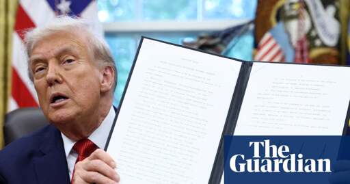
Memo from Marco Rubio reportedly said cutting Calibri from official communication would ‘abolish yet another wasteful DEIA program
US diplomats have been ordered to return to using the Times New Roman typeface in official communications, with secretary of state Marco Rubio calling the Biden administration’s decision to adopt Calibri a “wasteful” diversity move, according to an internal department cable seen by Reuters.
The department under Rubio’s predecessor Antony Blinken switched to Calibri in 2023, claiming the modern sans-serif typeface was more accessible for people with disabilities because it did not have the decorative angular features and was the default in Microsoft products.
Imagine being so insecure that you’re threatened by a font…
I’m threatened by wingdings… what are they really saying? (͡•_ ͡• )
deleted by creator
Ugh even the fonts they like are old and boring. Anyways, this is a Comic Sans administration if I ever saw one.
Actually insane.
Welcome to the culture war I guess, Calibri. God, this timeline is dumb.
Fascist timelines always are.
look i know literally everyone says this and it’s overdone by this point, but it’s true: we are in the onion timeline
Wasteful how?
It would be wasteful to miss ANY opportunity to blame Biden for fucking anything
How is using the default font wasteful? Apart from anything else I’m pretty sure it uses less ink.
Literally anything to avoid doing actual work.
Republicans are like the one asshole in the group project that shows up with some stale donuts once and thinks they’ve fulfilled their end of the group project responsibilities.
So true lol. They are the type of teammate who only shows up 20% of the time, works on one tiny piece of the project with lots of help from other members, then claims they did all the work or blames everyone else when the project doesn’t get finished on time.
I dunno, Times New Roman looks an awful lot like a book or a newspaper and reading is woke.
Switch to comic sans like a real murican.
Papyrus
deleted by creator
Missed opportunity to introduce a new typeface named Real Great American.
Switching to German Fraktur typeface would’ve been too on the nose.
The Nazis abolished Fraktur because they were thought to be influenced by Hebrew letters. They preferred Antiqua after 1941. There’s a bit of interesting history surrounding fonts and the Nazis. Their party newspaper Völkischer Beobachter used a font designed by a Jew.
The experts and my own eyeballs agree that Calibri is slightly easier to read than Times New Roman, and it’s an improvement in legibility that means a lot to people with poor eyesight. But Republicans don’t give a shit about people with vision issues, probably think they should pull their eyes up by their bootstraps, so Times New Roman it is.
What a bunch of fucking idiots.
What in the goddamn actual fuck?
Switch everything to Impact Bold. Go loud or go home.
One of my university profs absolutely hated TNR. He said that all the little ‘hands and feet’ were distracting, and I agree with him.