
third-party android modifications*
my family’s pixel devices, and mine running gos, don’t have this. nor the cell bar style, nor the ‘we have to advertise the wifi version so people feel good that bigger number = better’ wifi icon style…
the default is just a battery icon, though I have it set on my phone to also show the percent alongside it. this hasn’t changed in many years. blame your manufacturer and their skinning and modding.
OneUI 7 is visually a steaming pile of shit. Real “we have iPhone at home” vibes throughout. Specifically for me what they’ve done with icons, why cant i have white or colored icons with dark mode?
Beta testers complained so much up to release how uncohesive everything is and Samsung constantly shut down feedback with “this doesn’t meet our design goals”. Surprise, now it hits general public and everyone still hates their goals. This won’t ruin them, but it defintely makes me reconsider Samsung going forward.
Edit - yes I know there’s third party solutions to most android problems, but shouldn’t have to load apps and spend hours customizing to interface without vomiting.
Crazy that they didn’t actually leverage the beta for changing the UX too. A good beta isn’t just to catch bugs, it’s also to catch user experience problems.
All of my family members have Samsung phones and every single one of them has been complaining about the update. Normal people, tech people, it doesn’t matter. They all hate it. It’s actually kind of insane. The only reason I have been spared so far is that my phone is too old to get the new OneUI update. I can’t imagine any of them will buy a Samsung next time they buy a phone if the UI stays like this. People who buy Android phones are people who like Android phones. You’re not going to lure iPhone users to Android by being more like an iPhone because they’re just going to buy the real deal instead. It’s just stupid. Just the battery icon discussed in the OP was the source of a lot of complaints because it is extremely hard to read especially for older people.
Ha, uncohesive! Exactly. I was looking for a word what I think of the changes and can absolutely agree.
It’s a mess.
Bonus: my (Samsung) camera (app) didn’t zoom when I pressed 3x and after I pinchzoomed manually, I could not take a photo (button did nothing). That never happened before and I missed a good shot 🤬. Afterwards it worked again. Hope that’s not recurring…
deleted by creator
I filled up my storage and now I just get download failed notifications every morning. Happy accident, but now I won’t ever empty my storage again.
that’s just samsung though, i’m on android 15 too and my battery looks like a battery
They should’ve just copied iOS and made it look like a little battery.
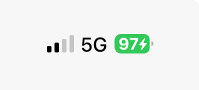
Hey at least it shows the battery percentage unlike the old default option!
Edit: i thought this was a samsung sublemmy, I missed Lemmy shitpost, but im not deleting what i typed i feel like i spent a good half hour bitching about it and frankly feel more vindicated seeing others complain.
full rant if you want it
I hate the battery not looking like a battery. Minor complaint tbh, I dislike it but I might come to like it.
Notifications now stop at 3. Why. Why the fuck. I moderate discord and modmail pings me 17 times an hour. I want to see that I have a text in Notifs, and now it just shows 3 discord icons when opened - I have to open the full tray. Negative user experience item
The split trays was fucking stupid. I have a fold and I STILL hate it. Fixed it in settings. Negative user experience to have forced it rather than asking. Moderate item since you can reverse it.
Adding 6 “quick items” at the top of the Tray is nice, since they fucked with the tray. It’s like…“we know we made the ui worse so here have quick access to 6 items you actually wanted as an I’m sorry present” The whole Tray is very iPhone. I did not pay for a Samsung to get an iPhone. People are welcome to like them, I’m not here to hate. But I specifically bought a Samsung phone with Samsung styled ui - if I wanted this feel id have gotten an iPhone.
Spotify now has like this…loading screen? It tells me when i have no service and won’t even open the app if I’ve lost internet (data off and walk too far from wifi) Difficult to see the upside to this “live status”. Minor poor user experience.
Google assistant has been removed from the bottom left swipe. Holy shit i hated that move. Why the fuck was it in the bottom left in the first place. Even worse, now it’s fucking Gemeni. Ai is actually ass. Turned it off and disabled it. Disabled the tile in my apps. Putting AI on my phone is a hard negative especially with the next item
Google assistant now no longer works. It just makes Google searches. I now no longer have a hands free way to tell my phone to “call (contact)”. Gemini did not recognise this command and is part of why I disabled and removed it. Now GA doesn’t either - continuing the trend of making GA more and more useless. This is such a hard negative actually has me considering turning Bixby on. Using the full phone book when I used to be able to tell my phone to call people is such a shit maneuver. Very, very poor user experience.
App drawers looks clean. Looks smooth. Reorganization is fine. Positive user experience.
They changed something about Home Screens but I dont know what. I feel like they shrank the icons? Gave me an extra row? Something. Feels off now. Somewhat poor user experience because the user is left feeling paranoid about what did or did not actually change.
voice-to-text was removed from the keyboard and then hidden and moved to the bottom left last. You know, the same spot Google assistant was also placed last update. Actual dogshit user experience hiding the VTT and making me dig through the internet to put it back. The fuck was this choice.
Overall negative and has me rethinking keeping with the Fold line given their price. If anyone has a Launcher to fix some of these issues or to restore voice text making calls, I’d appreciate it.
deleted by creator
It looks almost exactly like the apple one
It does not. Apple’s is a little battery. This looks more like a notification badge. Corner radius is too big, and it needs a nipple.
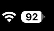
Not much that isn’t better with a nipple. Not going to argue with that
deleted by creator
Yeah I am sticking with my custom rom until the phone dies. Then probably getting a Sony phonr because those apparently have a no nonsense android on them.
I have two Sonys and love them both. I like that they’re thinner so it’s easier to hold, too. Still have headphone jack and side fingerprint reader.
Good to hear. I had a sony a while ago. Xperia Z1 compact I think. Great little phone it was. Sadly they now only make really high end phones anymore.
There’s always the 5 or 10 models. Those are still great and also pretty affordable if you scoop them on Swappa or eBay
I was actually thinking of getting a 1 year old model from ebay. Might reconsider again
Oh fuck, I hate this too. Fucked up the video player and a bunch of my settings as well. Why is everything so round!? Why did they fuck up my clock widget SO BAD!??
I AM STILL PISSED ABOUT THIS FORCED UPDATE. the second a linux phone is usable daily I will buy one. FUCK SAMSUNG
Sounds like you already have one. Samsung phones are pretty bad though.
I hate the single page scroll app drawer. I enjoy being able to swipe up to toggle between home and the app drawer. If you keep the single page scrolling drawer, you can’t swipe up to get back to home. You can change this and revert to pages like we had before, but for some unholy stupid fucking reason, you can’t sort it alphabetically. Like, really? I’ve had to manually reposition all of my apps, and for some reason the toggle seems to be pretty janky to settle an app into the place you want it, so insanely annoying. Add alphabetical sorting back, come on. Basic shit.
Don’t forget the search is now at the bottom of the app drawer instead of the top like it used to be.
For anyone on Samsung, I’ve also been fighting with with the OneUI changes, look into the GoodLock app from the Samsung App store, it’s published by Samsung and helps you take (more) control over how attributes behave and act, along with changing things like the Lock Screen looks and what shows up and how. I can give more info if anyone wants or provide screenshots here if anyone would like
Here’s a link to the app in their store https://apps.samsung.com/appquery/appDetail.as?appId=com.samsung.android.goodlock
Whelp, my Galaxy A16 is not supported.
I’m just theorising here, but I wonder if you could download the apk externally and try that way, I’m thinking they could just be software locking you out app store side
Ha! Not my problem. Thanks planned obsolescence 👍
And it shows up on the AOD now, and you can’t get rid of it. Plus, they changed smart select to some “draw on your screen” bulletin that takes an extra button press to get to, and it works worse than the version before at auto sizing to what you wanted.
They also changed the options for app grid layout to remove the 5x5. Now you just have 6x4 and 6x5. Plus the colors of the icons changed, and the default weather widget changes. I had my home screen in a way that I was used to, and now it’s all over the place. I feel like everything that was OK before got a huge downgrade, probably to make room for AI bullshit.
My AOD clock is bouncing around now and sometimes get clipped off the screen


