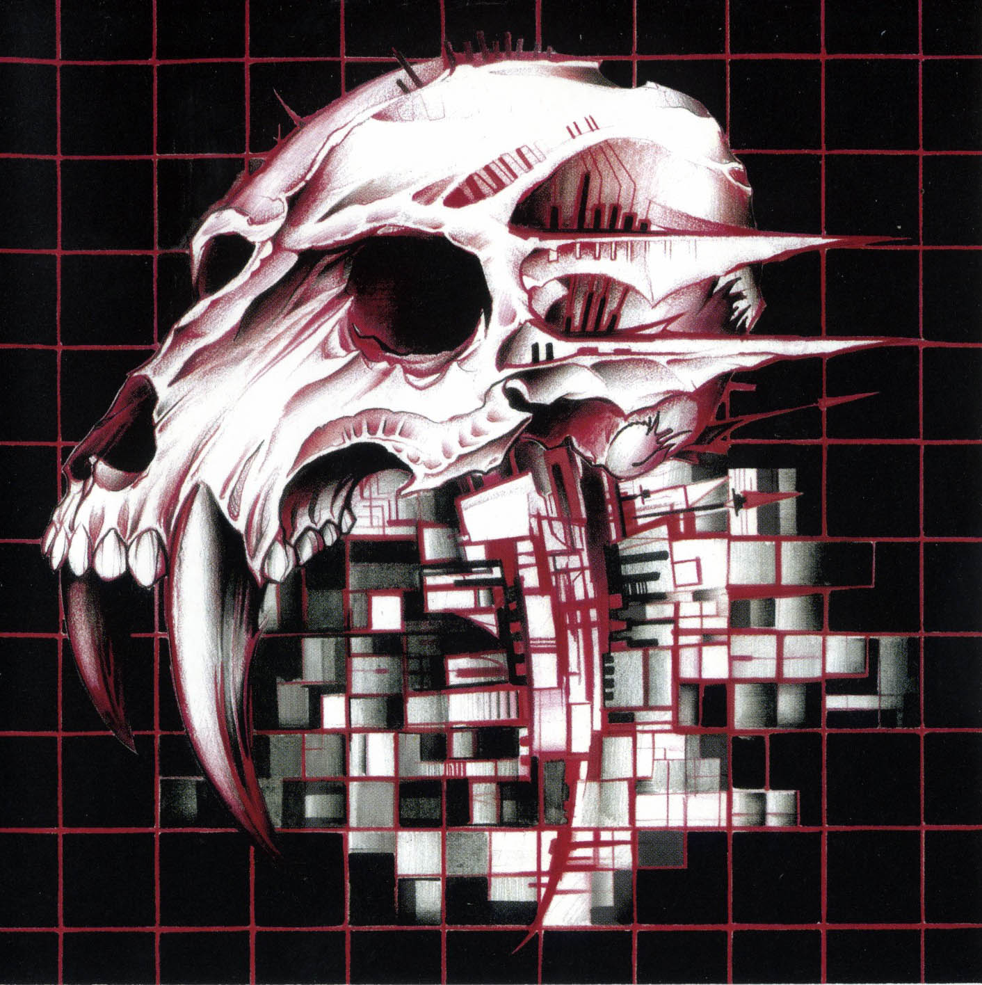
I don’t even know what it’s called, but I really hope it goes the way of Comic Sans
Edit: does anyone actually know what this awful font is called?
It’s either this shit or the fucking humanoid robot in every tech related post touching a holo screen showing completely pointless and unrelated data

You’re absolutely right to push bwck on this, it is a dogshit slop-font.
What else can i help you with today?
A few of the half decent, small YouTube channels I follow started using it in their thumbnails as a way to polish up their channel. Little do they know is all it does is suck the soul out of their content.
Is this Comic Sans Italic?
Is it actually a font? No same letter looks the same - look at every ‘S’ for example, they all differ. Very similar but not the same. Maybe its just slop?
Why is it that all AI fliers look like this though?
Because they made that the default look for flyers somehow
I was JUST thinking about how I see this on a bunch of ai slop and slop adjacent stuff recently!
To play devils advocate, I reopened Canva for the first time in forever.
Anti Canva rant
(Any service that could be free/no account, but wants an account is immediate red flag in my book. No one NEEDS an account to make a slideshow or poster. Plus I’m on the haveibeenpwned list of the 2019 data leak. But we 1 week away from the school Christmas concert, and the people in charge insist, )
But when I opened the website, there isn’t a clear warning to say “hey, this font or image pack is AI” you have to read the fine print to know for sure.
Canva itself advertises “hey, use our AI helper”, but for the 3rd party features? Up to the uploaded to say if its AI or not. (Still hate Canva though. Can’t wait for the concert so I can never open the website again)
Wrestling-Sans
Yes! It feels like every second restaurant in my area has suddenly gone with this font and AI slop images for their menus. Lets call it Tragic Sans or something like that.
I see that, I go elsewhere.
What I come to call the “300” typeface because it’s what all AI slop posters are like now. They’re more or less based on “Edo SZ” which has seen very frequent use.
EdoSZ or Friday13? https://fontmeme.com/friday-the-13th-font/
@cannedtuna@lemmy.world
Thanks!
Slop font is way worse than Comic Sans.
At least comic sans is easy on the eyes. easy to read.
Sloppy drip 2
It’s whatever chatgpt installed off civit ai’s fonts collection