I really don’t like the design of the progress pride flag, and I couldn’t really put my finger on it until I saw this: https://nava.org/good-flag-bad-flag
For reference, here is the flag I’m referencing as “bad flag”:

And here is the original:

So, the original has too many colors, but it’s the colors of the rainbow. In order. It’s recognizable from really far away, and it’s dead simple to draw.
With the Intersex flag, that’s 14 colors. There are three shades of “purple”. The circle won’t be visible from far away. The chevrons are too thin to be very recognizable from far away.
It’s not like there aren’t good pride flags. Like there are AMAZING ones:


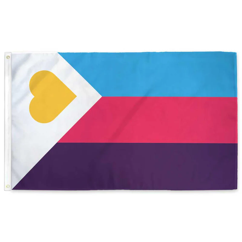


Edit:
In case you don’t know what these are: https://flagsforgood.com/collections/pride-flags
Its purpose isn’t to be aesthetically pleasing. Trans people and POC are constantly discriminated against by other queers, and intersex people rarely are even acknowledged to exist at all, let alone treated as anything else than disgusting or sex object.
This here boggles my mind. Why would you discriminate against others when you yourself know what discrimination feels like?
Strange is the world of bigotry.
Some think they can curry favour by thowing the bigots a bone. The ‘LGB drop the T’ group can fly under a radar for a bit by piling in on the most hated upon group but don’t seem to realise that they will be squarely back in their sights once the job is done…
deleted by creator
Ugly flags & the LGBT+ community, name a more iconic duo. Like, I thought we had designers amongst us, whatever happened to them?
But you see, Graphic Design is their passion!
Haha I came here to link this. One of my favorite videos.
OHIO!!
Oh god please no
deleted by creator
Fair warning with that one, its really cool looking but mostly popular with trans lesbians and terfs.
deleted by creator
Americans love to subdivide themselves, and that’s especially true for activists. The flag reflects that.
garbage opinion, you’re the kinda person that’d take issue with Black Lives Matter because you assume that implies white lives are inferior.
also, the progress flag is flown worldwide at Pride so you’re just spreading misinformation
Thank you for your opinion. I hope you have a pleasant day.
What annoys me about takes like this is that it seems to be appealing to some sort of council of gays who are in charge of the flags. Nobody is. There’s no “official” flag. If you don’t like the progress flag or the intersex version of it then just don’t fly them or design your own that you do like. Nobody is stopping you. A ton of the pride flags in use today are just designed by random Tumblr users in the mid '10s. Which is fine, not hating on them, just making sure you know there is nothing stopping you from making one you like or flying the ones you prefer.
I’m of the option that the original rainbow flag is still the best. It was meant to include everyone under the rainbow so trans people and others are already included.
The Progress flag stands for the progress that has been made and the progress that STILL NEEDS TO BE MADE against racism and transphobia as well as memorializing those we lost to AIDS.
So yes, while the original flag is meant to include all the LGBT+ communities, progress stands for more than inclusion for a lot of us ✌️
My problems with the progress flag and the trans rainbow flag are not with the groups or ideas they are ment to express.
First like OP I think they are bad flag designs. To busy and lack the simple design a flag should have. I also just don’t like the look.
Second there is value in a consistent recognizable design like the rainbow. I spot all sorts of variants and often don’t know what they are supposed to mean.
I also don’t think there should be spefic meaning to the parts. Saying this color stripe is this group and that color is another group is problematic.
The rainbow colors were meant to symbolize broad inclusion. Everybody under the rainbow. Red isn’t gay, blue isn’t lesbian, etc. (I know some have tried to add that after the fact).
When you start adding spefic groups to the flag you start having included groups and excluded groups. So as much as I support trans rights and think they belong in the community I don’t want any spefic group in the flag.
You then get groups that are not included and want a new flag to included them. Like we are seeing with the trans flag causing groups to want the progress flag. Pretty soon the rainbow is going to look like nascar with logos everywhere.
A simple consistent flag with the message of broad inclusion is better.
I think you’re missing the forest for the trees and I don’t think I’ll be engaging with your slippery slope argument ✌️
I doubt it’ll ever be redesigned.
The reason it’s badly designed as is, is that people wanted specific inclusion into the primary symbol. There’s really no way to change a rainbow; it’s the standard spectrum of visible light being used as a symbol of everyone in their diversity being part of a group.
To be any more inclusive, you have to put things on top of the already inclusive rainbow. A corner piece or an inset is the only way to do that that isn’t horrible looking no matter what it is.
The chevrons from the side are at least visually balanced, though not well chosen colorwise. Then again, the representative colors weren’t chosen with being added to a flag in the first place.
Once you start changing an established symbol rather than just coming up with a new one, design goes out the window. It’s no longer cohesive because it can’t be. It’s like the difference between someone planning a tattoo that covers their arm, and someone getting a few dozen tattoos on their arm. Shoving things together without a plan ahead of time is airways going to be less visually pleasing.
But, visual pleasance isn’t what the flag is for, so maybe it’s more effective than something planned from the beginning. I dunno, but the fact that it isn’t “just” a rainbow does mean you can’t mistake it for someone liking rainbows in general, so that could be a benefit of that change.
I don’t agree that the original rainbow flag has too many colors though. If you don’t have the standard color spectrum there, it isn’t a rainbow to most people’s minds, so it would be worse design. The standard ROYGBV is standard for a pigment rainbow for a good reason.
I’m not advocating for removing the rainbow. You could literally “cut” a big rectangle in the middle and just have a different color background with extra things, paying homage to the original rainbow flag and having center balance. The only good thing I have to say about the chevrons are that it establishes vertical and horizontal orientation.
I’ll have to mull over your statement about being more effective that something planned from the beginning.
Aside from the design of the flags, scrolling through these ones felt a bit like a colour blind test. Especially the demi-flags.
it’s a long time meme that pretty much all LGBT flags are awfully designed. but they also got wide acceptance so it’s hard to redesign. as a designer I’ve looked for redesigns and have not seen anything really. even the ones you’ve shared are brand new to me. where did you find those?
Why does everyone complain about the progress flag when the poly flag is right there and is terrible? Absolute garbage. Terrible color choices. Barely holds up to heraldic color rules. and Pi? Seriously? Get out of here you fucking nerd. 2/10, workshop it and come back. I hate it.
I’m cool with poly people, this is just the flag equivalent of biting your tongue when eating a burrito.
That’s the old secret code one. The new one is listed in this post already

Oh yeah that’s so much better
Seen it, is better, not heraldic, still hate the old one so much. Secret my ass everyone knew what that flag meant
Aah bad flag jumpscare
I’m pretty picky about flags but I like the progress pride flag well enough. not over the moon about it, but I fly it outside my house during June. If you can make a better one, it’s always okay to attempt to do so.
That’s not actually the original pride flag. That’s the one with 2 mission stripes that were taken away due to cost. The original had turquoise instead of blue and a pink and indigo stripe, so one color more than the rainbow. Rainbows have red, orange, yellow, green, blue, indigo, and violet.
The 8 striped also symbolized different things. https://en.m.wikipedia.org/wiki/Rainbow_flag_(LGBTQ)
I agree with what you’re saying. As they keep adding more things to the flag, it becomes cluttered and harder to see.
Flags are stupid in the first place though. All flags, it’s nothing to do with these specifically.
Agreed.
Though I do think that if progressive-minded people were more apt to fly the American flag at protests, it would be harder to criticize them.
good thing the flag doesn’t exist for outsiders to opine about, eh?

